Mockups-V2Artboard-3-copy-4.png

Strong Roots

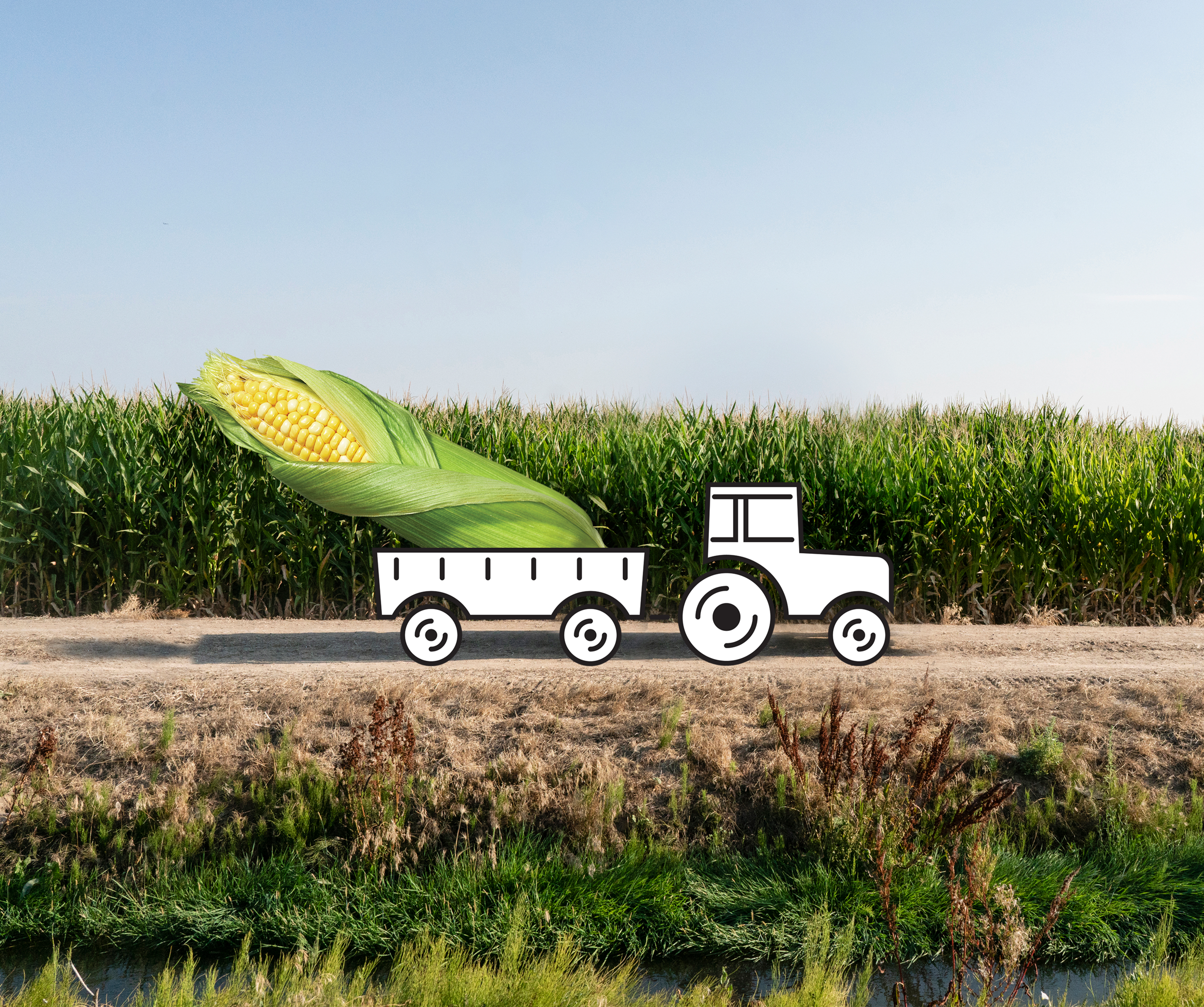
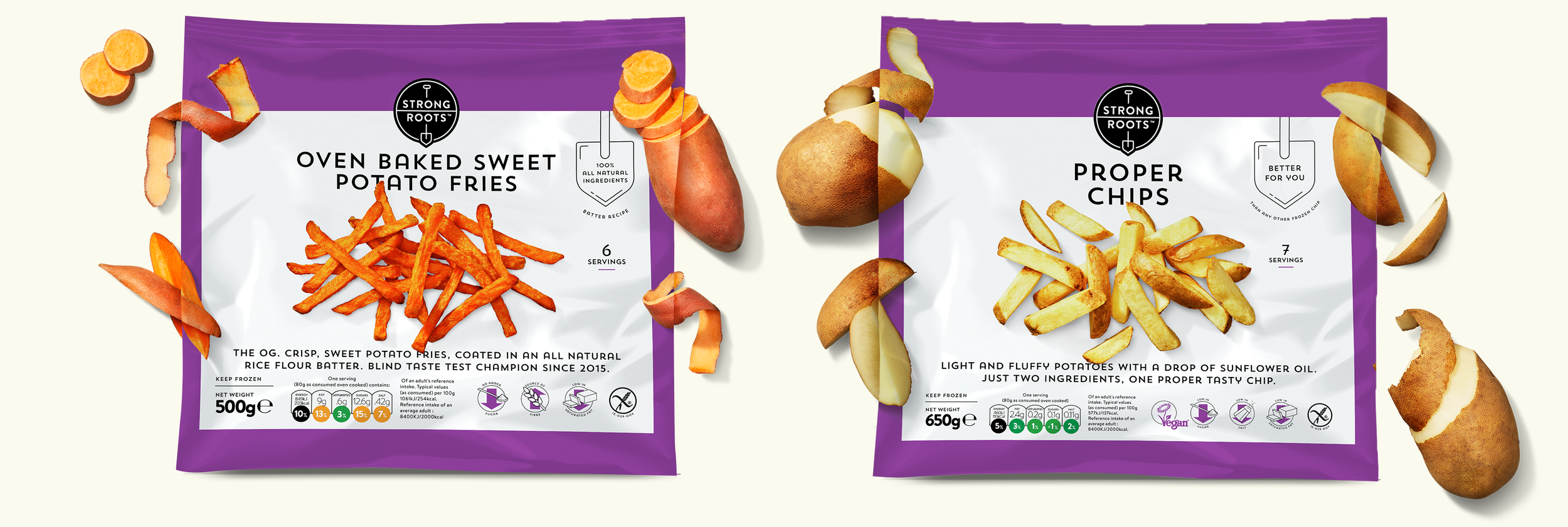
Strong Roots’ proposition is simple: vegan frozen food that’s not only easy to prepare, but packed with both delicious farm-fresh taste and nutrition. Well-established in the UK, SR called us to help them re-position their brand for the US market. We landed on Keeps You Grounded, emphasizing not only Strong Roots’ hearty ingredients from the earth, but also their food’s ability to help people live well-balanced lives.

But we didn’t stop there. Our task soon exploded into an international packaging re-design project, complete with a logo redesign, suite of photography, and packaging layout – all within the confines of a COVID reality. Virtually coordinating clients, photographers, food stylists, and print production houses from San Francisco to Belgium, we successfully launched the first set of the new packages in the UK and US and will continue to art direct, shoot, design, and guide production of 28 more SKUs throughout the next year.

Agency: OBERLAND
ECD: Bill Oberlander | CD/Art: Sophie Forman | CD/Copy: Dhruv Nanda | Design Director: Arnau Bosc
Designers: Erica Heitman-Ford, Carly Nalven, Laura Moore | Exec. Producer: Kelsea Seavey

Photographer: Annabelle Breakey

  Our rework of the Strong Roots logo simplified and focused the design, honing in on the element of the spade as the emblem of the brand. The line between the two words serves as a horizon, allowing for playful layering of the logo to signify the sp


Our rework of the Strong Roots logo simplified and focused the design, honing in on the element of the spade as the emblem of the brand. The line between the two words serves as a horizon, allowing for playful layering of the logo to signify the spade plunging into the earth.

StrongRoots_LogoAnimation_5.gif
StrongRootsArtboard-4-copy-3.png
StrongRootsArtboard-1.png
 Vibrant bird’s eye photography is the backbone of the design,  giving the illusion that the food is three-dimensional and leaping out from the surface of the package. Supporting ingredients show the products roots – literally and figuratively.

Vibrant bird’s eye photography is the backbone of the design, giving the illusion that the food is three-dimensional and leaping out from the surface of the package. Supporting ingredients show the products roots – literally and figuratively.

StrongRootsArtboard-3-copy.png
StrongRootsArtboard-3-copy-3.png
cauliflowerArtboard-1-copy.png
StrongRootsArtboard-3.png